Hi,
I have a question, that I fear is very stupid and I’m just blind:
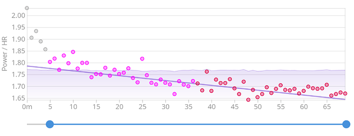
I’m looking at the graph for aerobic decoupling and wondering: What is the graph in the background showing? We have the points, first half and second half. Those are clear (and explained on the right). Then we have another line going through the graph. What is that plotting? Here’s a screenshot to illustrate:
Best,
Marcus
