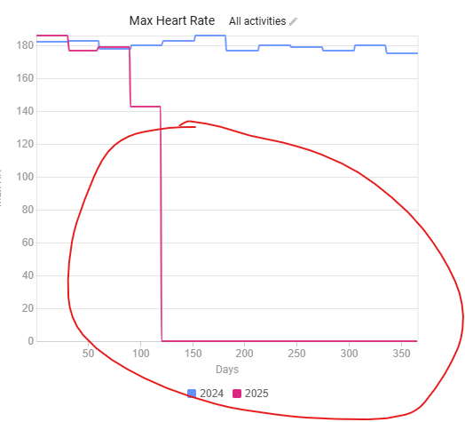
Is there a way to being able to adjust the axis so charts don’t look like this?
Thanks
@david I believe this is an easy fix, just like you did with weekly stats