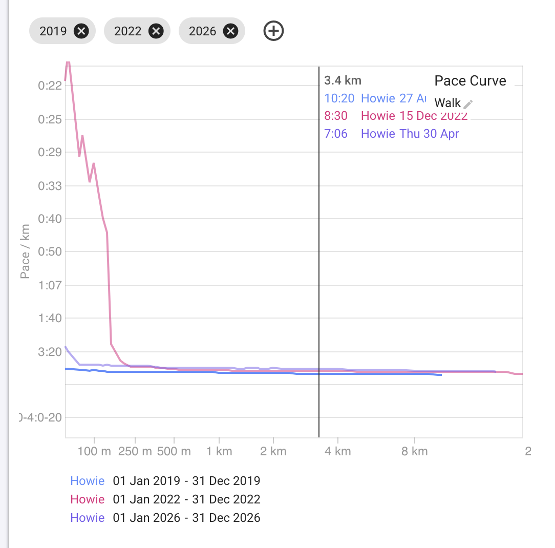
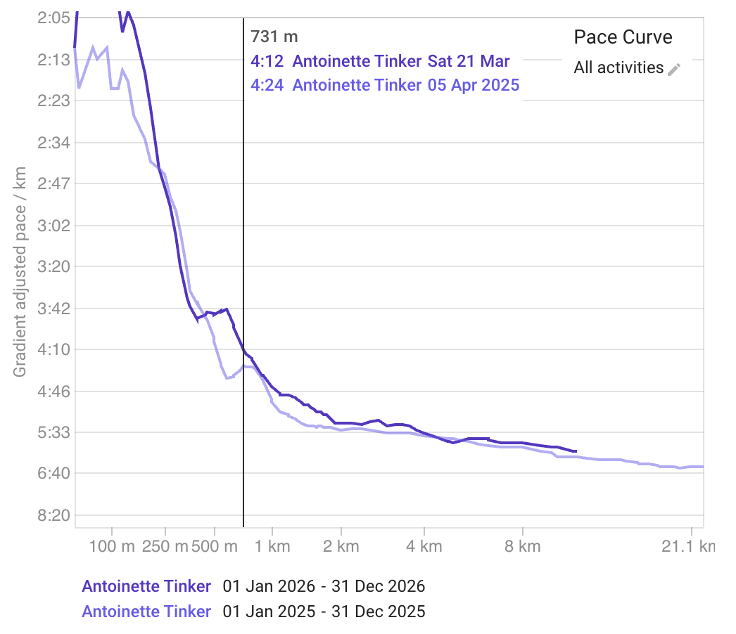
You can compare pace curves for different athletes and time periods on the /compare page:
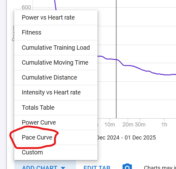
Click “Add Chart” and choose “Pace Curve”:
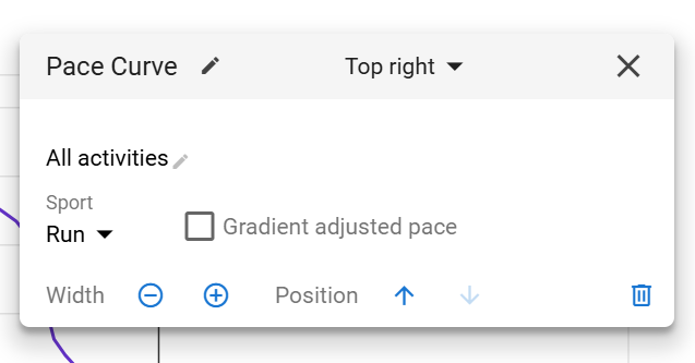
You can then rename it, choose the sport, choose the activities, and other settings:
You can compare pace curves for different athletes and time periods on the /compare page:
Click “Add Chart” and choose “Pace Curve”:
You can then rename it, choose the sport, choose the activities, and other settings:
Very nice, thanks.
But this one is not following the period color scheme like the others, which can be confusing.
Tx. We will sort out those colours soon.
usefoul, thanks. What about HR curve
That colours should now follow the same scheme as the other charts (tx @ryandev ).
They do, even without having to recreate the chart 
Thx!
This is super. Thanks!
Is there a way to adjust the axis so that differences are seen more clearly?
For example, the paces are very different at the marker location but the graph would have one believe the paces to be nearly identical.
Likewise, weird stuff happens in those first few hundred metres as the GPS locks in; I’m most interested in 1km to 20-30km
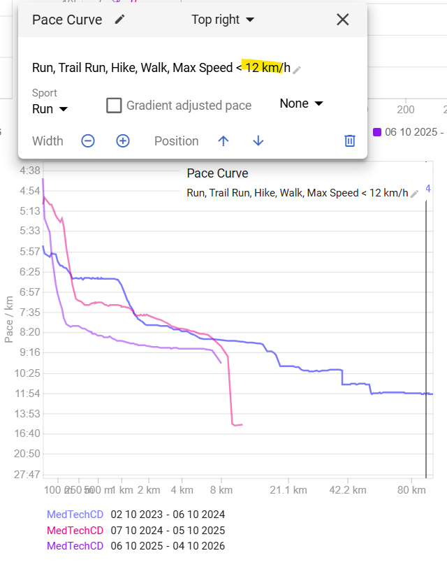
To avoid those outliers, you can add some filtering like this for example
This will filter out points with high speed caused by GPS glitches and also allows you to focus on a compacted speed scale.
EDIT: this will actually filter out activities where max speed is beyond the limit set, and may not be the solution, depending on our case. Can’t see any other way to do it. Or you should check the activities returning those high speeds and Ignore parts of them.
Hmm, I played with speed and pace but couldn’t get it to work. If I could adjust the x & y- axes to desired scale that would limit seeing the wonky activity start data.
FWIW, I want to adjust x & y scale for swimming as well. I don’t much care about pace for distances <1000m. Just everything > that.