Activity: workout line is off for distance-based steps

Today’s run started with an easy segment and then two short sprints:

1.05km Z1-Z2 (184-259w) FTP power=3s
0.05km Z4 (289-331w) FTP power=3s
0.25km Z1-Z2 (184-259w) FTP power=3s
0.05km Z4 (289-331w) FTP power=3s
...

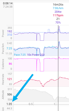
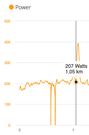
Watching this on Garmin Connect, the start of the first power spike is right where expected, at 1.05km:

In intervals, the distance is also perfectly aligned with the power peak, at 1.05km (ignore the blue overlay line in the power chart for now).

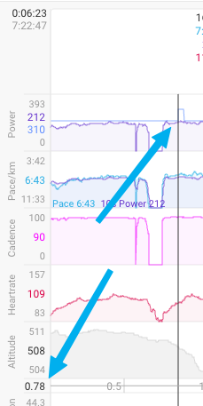
But the thin blue line overlayed on top of the power, indicating the workout builder steps, is off; the upwards flank of that first sprint is shown at 0.78km:

The root cause is clear if we look at the times instead of distances:

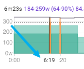
The workout builder guesstimates that it would take me 6:19 minutes to run those 1.05km:

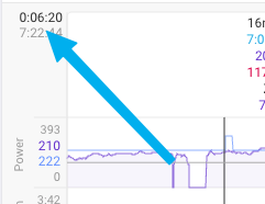
And this timestamp is exactly where the line goes up in the overlay:

The problem is of course not that the workout builder estimated a wrong time (it couldn’t know that I had to wait for a green light…). The problem is that the thin blue line is plotted according to the guesstimated time, not the distance!

The shift then continues through the whole run of course:

image

All the data is right there: the workout builder knows all the distances; the distances are correct in the FIT file; intervals.icu sums them up correctly in the “distance” chat, and for such a case, where a step was planned with distance instead of time, it should use this info for the display, not the predicted time of the step.

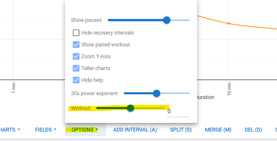
Any constant offset is easily corrected with the Workout slider under the Options menu.

Anything in Intervals is plotted on a ‘timeline’ and not a distance line. The distance displayed is a result of your intensity during a certain time. Load/TIZ etc can’t be calculated from a distance line. You need a timeline.

@MedTechCD, the data is right there. Right now, intervals.icu could automatically plot it correctly on the timeline without user intervention if the algorithm would take the distance into account as laid out above.

This is more a feature request as a bug. As you showed above, the chart is drawn by time.

Currently all charts are time based. There are different topics with the feature request to draw charts by distance.

This is not a request to switch the X axis to distance instead of time.

The way the workout overlay is plotted over the power chart right now simply makes no sense if the steps are distance based. It is objectively wrong; it is confusing; it makes the user second-guess their devices or the algorithms. It is not possible to correct this simply by shifting the whole line with the slider shown above; it is not a constant offset. If it is hard for the team to view this as a bug then feel free to move it to Feature Requests, that’s hardly the main point. :wink:

The way it is plotted right now probably was decided back then because intervals.icu already knows how to guesstimate the durations from the workout builder steps alone (which it must - for displaying the planned workout before it is executed this is a requirement of course, and overall this estimation works very well to predict the workout duration), and at the time the graph was implemented this was simply overlayed. No offence to anyone, it is clear that sometimes a quick solution is better than none at all, and it does work perfectly fine for time-based workouts.

The proposed solution would be to adjust the thin blue line (the overlay on the power display, in my screenshots) to still be plotted on the timeline, but have the X coordinates be adjusted via a reverse lookup of the distance. It would then work fine for both time- and distance-based workouts, and even for mixed ones. intervals.icu already sums up the time-distance data from the FIT file; it is displayed right there in the screenshot.

(N.b., it would still be off for steps including the “press lap” button, but that would be a suggestion for a different topic, possibly involving the LAP markers contained within a FIT file itself - totally different, totally out of scope, please disregard for now).

Pseudo code replacing the way the blue line is plotted now would be like this, using only data structures that clearly are already present within intervals.icu (they are displayed right there in the screenshots):

current_step_start_time = 0
fit_file = (object representing the current FIT file)
workout = (object representing the workout builder steps associated with it)
distance_chart = (the existing graph displaying the distance on a timeline)

for step in workout.steps:  

    if step.volume_metric = "time":
        current_step_end_time = current_step_start_time + step.duration
    elif step.volume_metric = "distance":
        current_step_end_time = calc_end_time_from_distance(current_step_start_time, step.distance)
    else:
         panic # are there other possible volume metrics? I don't think so?

    # Note: still gives wrong results with steps based on "press lap", ignore that for now...
    
    plot_thin_blue_line(current_step_start_time, current_step_end_time, step.y_axis_value)

    current_step_start_time = current_step_end_time

The distance-time conversion is done like this, basically a reversal of the existing time-distance plot, based on the fact that it is a monotously increasing graph:

def calc_end_time_from_distance(start_time, distance):
   start_distance = distance_chart[start_time]
   seconds = 0
   while start_time + seconds < fit_file.duration:
        if distance_chart[start_time + seconds] - start_distance >= distance:
             break
        seconds += 1
   return start_time + duration

I do not know how to make it any clearer; I am just a random computer scientist and data engineer and not a native english speaker - I seem to have trouble getting my ideas across on this forum, sometimes. Maybe the pseudo code helps. If you guys think that it is not necessary or useful to display this line correctly in this way, then I rest my case. I am not asking to implement it exactly as I wrote, it’s just supposed to be a rigorous way to express my idea. I’m sure @david would come up with a proper solution himself with his deep knowledge about what data structures he has available in the code. I do not make a request to put this high on the priority list; obviously the team has to take the priority, effort and availability of the coders into consideration.

Thanks for the efforts, all!
Hi!

Thanks for raising this issue @Another_Intervaler. Here is another example of the drift that happens when distance-based intervals are plotted using estimated time instead of the inferred distance:

image

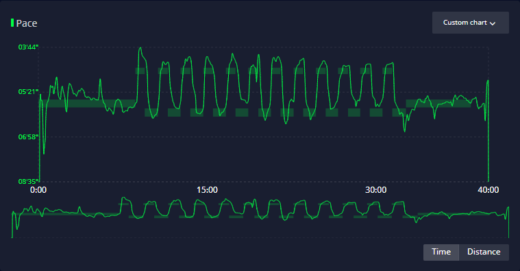
And what it should look like (from the Coros web app):

Notice that the Coros graph shows the interval markers correctly while still displaying time on the x axis. This also means that the interval markers show up as having slightly irregular lengths on the time scale, since they depend on how quickly that interval’s distance was covered.

Maybe @eva can provide an “easy” fix, if possible. I’m thinking of “just” mapping the distances of the workout to the completed distances and their timestamps.
Though I don’t know if it’s easy to do …

Hey, I’m looking for more activites which has workout paired and is distance based. The first activity linked is a “faulty” one because the user didn’t do the first recovery interval, instead continued straight to harder effort.

Does anyone have runs with workouts and are willing to share a link?

I have runs for 30-40 minutes with workouts in Jan 2018 to Nov 2019. Might be easier if you follow me and you can go through the (filtered) workouts.

Thanks, I dont need to follow you :slight_smile: I’ll check them out. Edit: I didn’t find any runs with paired workouts?
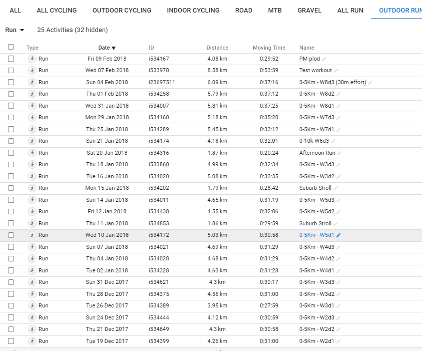
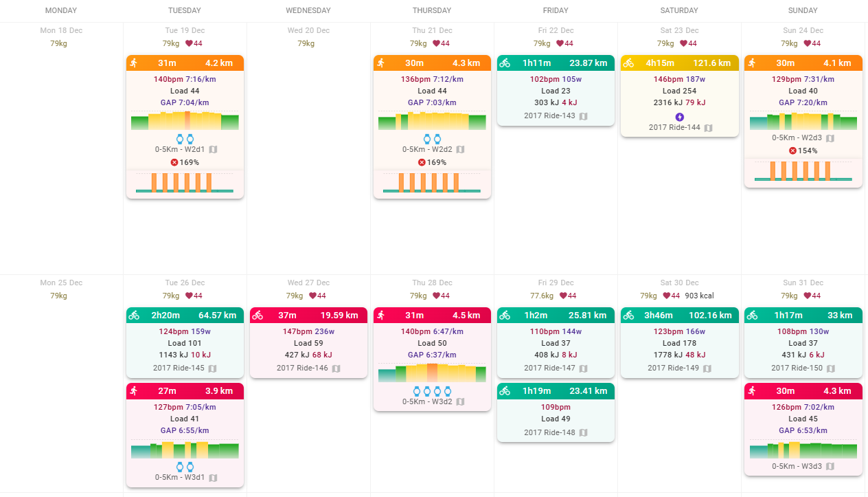
Start in January 2018, as it might be less structured workouts after May.

Can you link me an activity with paired workout, since I cant seem to find any.

Oops.
I think I used Garmin for the workout plan, and not directly in Intervals.
I’ve added the planned activities to 19/12/2017 to 07/02/2018, as it was a 0-5K plan in my workout library, so easy to fix.


That lap may look faulty because it is one which continues until a LAP PRESS. You can look at almost all of my workouts, I program almost everything with distance. Intervals.icu had no LAP PRESS and no other pauses.

Or you can reproduce it quickly yourself - program some activity with, say, a few 50m intervals and walk/run/ride them much slower or faster than intervals.icu thinks you would. Then you know for sure there are no artifacts…

By the way, thinking about the issue more… if there is a reliable way to extract when a lap starts on the watch, then matching that timestamp with the intervals in the workout should be good too. I don’t know about other watches but on Garmin it isn’t even possible to skip or add laps during the activity, so aside from stopping early it should be perfect…

No idea if that info is stored in FIT files though.