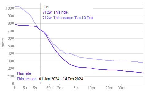
The power curves displayed on the activity power page and the pace curves on the pace page now exclude the activity you are viewing. So you can see clearly where you have improved:
This is how it looked before the update:
The power curves displayed on the activity power page and the pace curves on the pace page now exclude the activity you are viewing. So you can see clearly where you have improved:
This is how it looked before the update:
Wouldn’t it be better if contrasting colours?
yep, finally ![]()
Thanks David
I swear, you’re a mindreader. I just had a 30s PB a few days ago, was looking at the power graph, and was thinking it would be nice to see what the previous value was. You rock!
very good change ![]()
Nice. Good change! ![]()
This doesn’t seem to work for me for “This Season”:

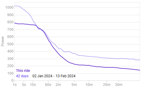
It does work for “42 days”:

Very modest improvement but it is visible here ![]()
Activity 10756219340 if you want to have a look.
Thanks!
Great upgrade!
Thanks. I just fixed that and will deploy Thurs AM (GMT+2).
Also for “All Time” ?
(i just got a new 30s PB that beat a previous PB from over a year ago!) ![]()