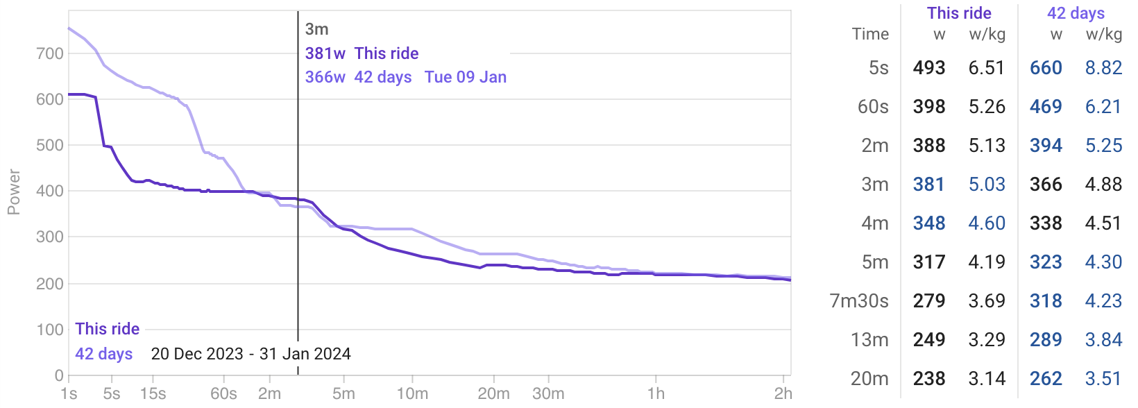
When visualising an activity Power Chart, we get an immediate sense of how our activity stacks up against a certain historical power curve, like “Last 42 days”, “Last 84 days”, etc.
Usually, if this activities’ power curve is below our history, that’s easy to visualise and we understand by how much we’re below, as such:
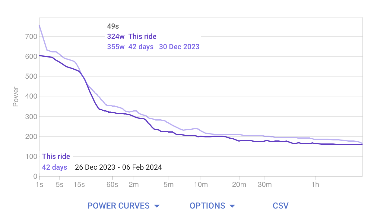
However, every now and then you will record an activity whose power becomes your “Last 42 days” maximum. At that point, the current activity line becomes the only line visible in the graph, as such:
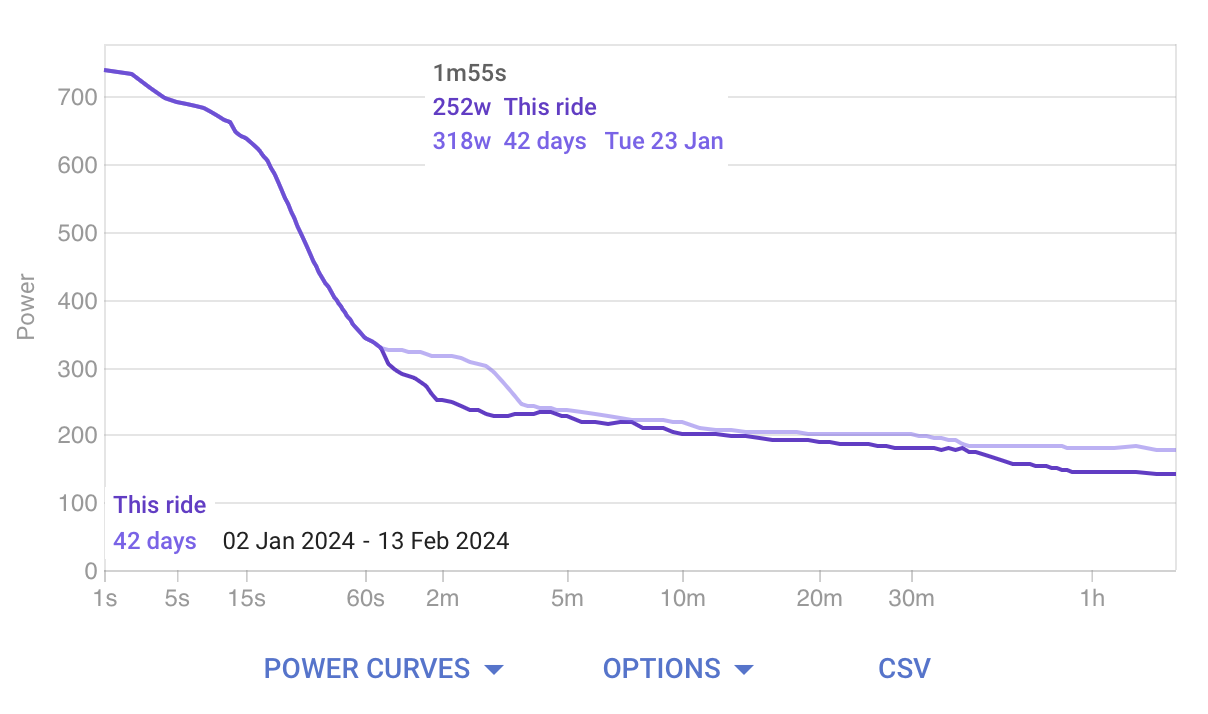
Given this, you now lose the sense of by how much you have improved against your selected data range.
If the activity day’s power were compared to the Last 42 days, excluding the activity day, you would get the sense of where you were, and how you’ve become with this activity.
My request, would be to include a checkbox that could be placed next to these ones that would “exclude activity day” from the “Last N days” range, thus giving you a basis for comparison.[1]

[1] of course, this would not apply to custom data ranges where the user selects exactly the period they want to compare against.
Let me know if it’s a stupid idea or could make some sense.