Hello,
I spotted a graph on an Insta post (kudos to Enduraw for their work) and I was wondering if Intervals can generate same graph from an activity?
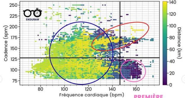
Heatmap and then scatter plot with HR on X axis and Running Cadence on Y axis, then for the color this has to be Cumulated Distance for the activity so light color should indice start of the race and dark the end of the race.
PS: by the way in raw data I could see Cadence is halved how do you make it double on graph?
PS2: below the graph I’d like to make:
1 Like
Update: if anyone is interested I managed to create the graph I wanted using Python in a Colab notebook thanks to Gemini AI assistant. Kudo to a blog article I found for the inspiration using Jupyter notebook and FIT file analysis. My question would still remain if Intervals could do such graph ![]()