Hi,
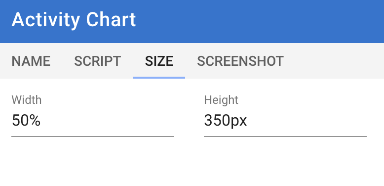
I created a custom activity pie chart for my heart rate zones. It’s all working, but how do I get the chart to align with the other charts, or how can I have two charts on the same line, next to each other?
Hope my question is clear.

Script:
/**
 * Generates a Plotly pie chart displaying heart rate time spent in intensity zones (i1-i5).
 * - Includes "Below i1" as a separate category.
 * - Slices represent time in seconds.
 */

const finalChart = (() => {
    const activity = icu?.activity || {};
    const streams = icu?.streams || { get: () => undefined };

    // Define heart rate zones
    const HR_ZONES = [
        { name: "Below i1", lower: 0, upper: 99 },
        { name: "i1", lower: 100, upper: 137 },
        { name: "i2", lower: 138, upper: 156 },
        { name: "i3", lower: 157, upper: 166 },
        { name: "i4", lower: 167, upper: 175 },
        { name: "i5", lower: 176, upper: Infinity }
    ];

    const ZONE_COLORS = ['rgb(200,200,200)', '#b6ffd3', '#6cea9f', '#fff871', '#ffbe57', '#ff8383'];

    let movingTime = activity.moving_time || 0;
    let heartRateData = streams.get("heartrate")?.data || [];
    let timeInZones = Array(HR_ZONES.length).fill(0);

    // Assign time to each HR zone
    heartRateData.forEach(hr => {
        if (!hr || hr < 0) return;
        for (let i = 0; i < HR_ZONES.length; i++) {
            const zone = HR_ZONES[i];
            if (hr >= zone.lower && hr <= zone.upper) {
                timeInZones[i]++;
                break; // Ensures each HR value is assigned to only one zone
            }
        }
    });

    const formatTime = (seconds) => {
        if (isNaN(seconds) || seconds < 0) return "Invalid time";
        const h = Math.floor(seconds / 3600);
        const m = Math.floor((seconds % 3600) / 60);
        const s = seconds % 60;
        return [h && `${h} hour${h !== 1 ? 's' : ''}`, m && `${m} minute${m !== 1 ? 's' : ''}`, s && `${s} second${s !== 1 ? 's' : ''}`]
            .filter(Boolean)
            .join(', ') || "0 seconds";
    };

    const totalMovingTimeFormatted = formatTime(movingTime);
    const totalHeartRateTimeFormatted = formatTime(timeInZones.reduce((sum, sec) => sum + sec, 0));

    let pieValues = [], pieLabels = [], pieColors = [], bpmRanges = [], formattedDurations = [];

    HR_ZONES.forEach((zone, index) => {
        if (timeInZones[index] > 0) {
            pieValues.push(timeInZones[index]);
            pieLabels.push(`${zone.name} (${zone.lower}-${zone.upper === Infinity ? `${zone.lower}+` : zone.upper} bpm)`);
            pieColors.push(ZONE_COLORS[index]);
            bpmRanges.push(`${zone.lower}-${zone.upper === Infinity ? `${zone.lower}+` : zone.upper} bpm`);
            formattedDurations.push(formatTime(timeInZones[index]));
        }
    });

    const pieTrace = {
        type: 'pie',
        values: pieValues,
        labels: pieLabels,
        marker: { colors: pieColors, line: { color: 'white', width: 1 } },
        text: bpmRanges,
        customdata: formattedDurations,
        hovertemplate: "<b>%{label}</b><br>" +
                       "Range: %{text}<br>" +
                       "Percentage: %{percent:.1%}<br>" +
                       "Duration: %{customdata}" +
                       "<extra></extra>",
        textinfo: 'percent',
        textposition: 'inside',
        insidetextorientation: 'radial',
        hole: 0.4,
        sort: false
    };

    const layout = {
        height: 350,
        title: {
            text: `Heart Rate Time in Intensity Zones<br><sup>Total Moving Time: ${totalMovingTimeFormatted}<br>Total Time with HR Data: ${totalHeartRateTimeFormatted}</sup>`,
            xref: 'paper',
            x: 0.5
        },
        margin: { l: 0, r: 20, t: 90, b: 20 },
        hoverlabel: { align: 'left', bgcolor: 'white', font: { color: 'black', size: 12 } },
        hovermode: 'closest',
        showlegend: true,
        legend: { orientation: "v", x: 0, xanchor: 'middle', y: 0.5, yanchor: 'middle', traceorder: 'normal' }
    };

    return {
        data: pieValues.length ? [pieTrace] : [],
        layout: {
            ...layout,
            annotations: pieValues.length
                ? []
                : [{ text: "No heart rate data available in defined zones.", xref: "paper", yref: "paper", showarrow: false, font: { size: 16 } }]
        }
    };
})();

finalChart;