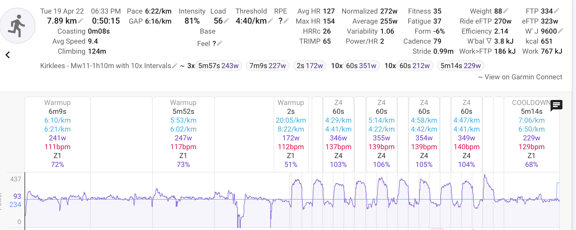
In this chart, what does the cyan y=‘234’ horizontal line represent in the power chart - it doesnt seem to correlate with any of the averaged or normalised data shown at the top and doesnt match an FTP or any other data?
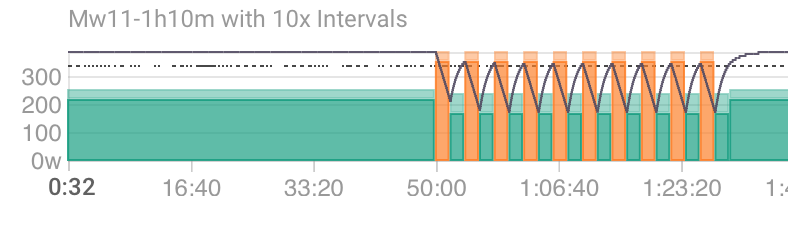
Also - here’s the matched workout I was following it seems the duration of everything is doubled compared to the actual programmed workout…(the 3x5ms57s + 7m9s + 2s shown at the top is just how the opening 25mins of WarmUp gets interpreted because I have auto-lap on my Watch at every km - its then got the 10x 60sec and 10x60sec as planned, but in the ‘match’ it shows a 50min warm up and then 10x2mins and 10x20mins)?
It would be really good if the cyan line on the Power chart could follow the planned power so I could glance and see how good my adherence to plan is…is that possible?
Also - in this same activity screen, under the Options menu there is a Workout slider…it doesnt seem to do anything that I notice, any ideas?
Actually, scratch that - I can see the cyan line jumps up right at the far right - it IS showing the planned workout isn’t it, just it’s not right because of the scale being doubled up.
Its very odd - the alerts pop up at the right time on my watch (after 25mins, after 1min etc)…but if I look back at the definition, they seem to be getting interpreted incorrectly?
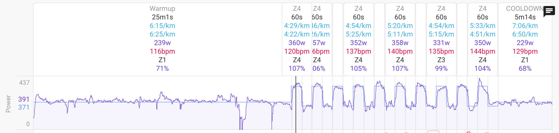
That thin blue line is the planned power from the workout. The slider in options lets you align the planned workout to what you actually did. But in this case the plan had " 1m 1m" for Z4 and recovery and that has created 2m intervals but you actually did 1m so it doesn’t match.
I didn’t know 1m 1m would make 2m but the solution is to remove one of the 1m
Thanks - yes it all slowly dawned on me over the last few mins!
I think originally one of the “1m” was interpreted as a label that would be thrown up at the start of each step, but something must have changed along the way.
Its very odd though that I get the alerts at the right time on the watch (Garmin) though!?
No big deal, I’ll just edit my established plans to correct them - delete and reapply.
There is different code generating workouts for Garmin/Suunto etc. to the code that generates the data for the skyline charts on the client. So it is quite possible that the “1m 1m” is seen as “1m” only when the workout is generated for Garmin.
Is it possible to have an option to where the adherence/skyline chart shows both the upper and lower of the target range of a pre-planned matched workout overlaid behind the Power chart?