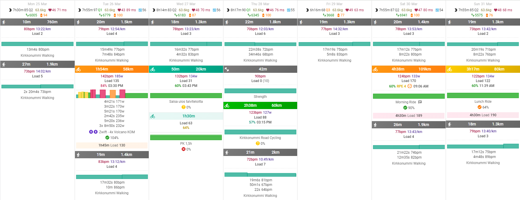
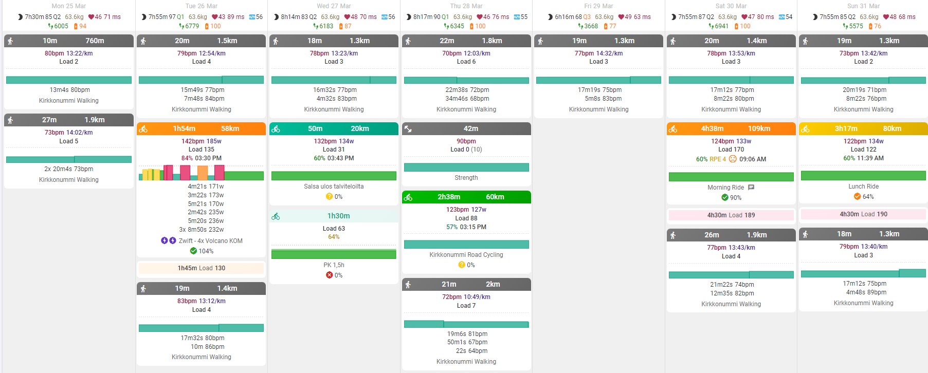
Now that there are skylines for every activity and planned workout the calendar view feels a bit cluttered and I cant distinguish multiple activites from each other anymore very easily.
So I made a some CSS tweaking for the activities to distinguish them better.
I am by no means a UI/UX designer so the end result is not that awesome, but I think you’ll get the point. Atleast the planned workout needs some tweaking more to be shown inside the activity “card”, but I didn’t want to touch the DOM with js.
That does look better than my efforts! Thanks so much. I am way more of a back-end developer than front-end! Only thing is it uses a little more space but for sure this is going in for “normal” size screens!
This is awesome! Honestly my biggest gripe was the difficulty distinguishing multi activity days. So happy this has been adopted. I was also applying custom styling to the cal on my local device but this looks much better. Thank you!
@eva just noticed these changes, well done. Thanks @david for incorporating that so fast.
@david , related: any thoughts on adding a user preferences section for custom CSS? I have some styles for intervals.icu that change the font to monospace and adds a background image. I’m sure some other folks on the forum could suggest more useful tweaks and it might be fun to have a thread here where we share them.
This is such a good change, thank you to you both!
My only comment / suggestion is that days with no activities show up in white (like a workout ‘card’) and it might make more sense to have them as the background grey.
But that’s a tiny thing. The new design is a lot clearer
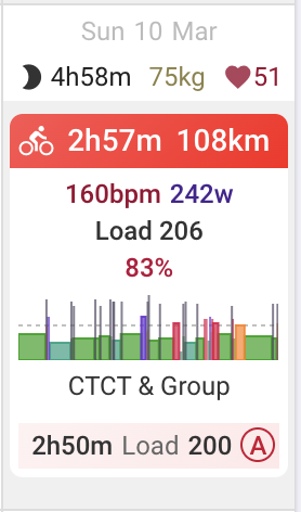
I noticed that you do not have the activity skyline charts enabled. Do you prefer having them off?
It’s probably easier for people to just continue using browser extensions for that. The css is already tricky to maintain. It has evolved organically right since the first days of the project. If it was all neat and tidy then maybe.
Yep, preference to not have them on most of the time. Things become a little bit too busy for me with them on and I can’t focus in on the important things easily enough when I want to scan over the calendar etc.
Its a good feature though! And like most of the features, having the option to switch on/ off is great.