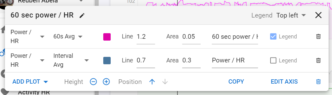
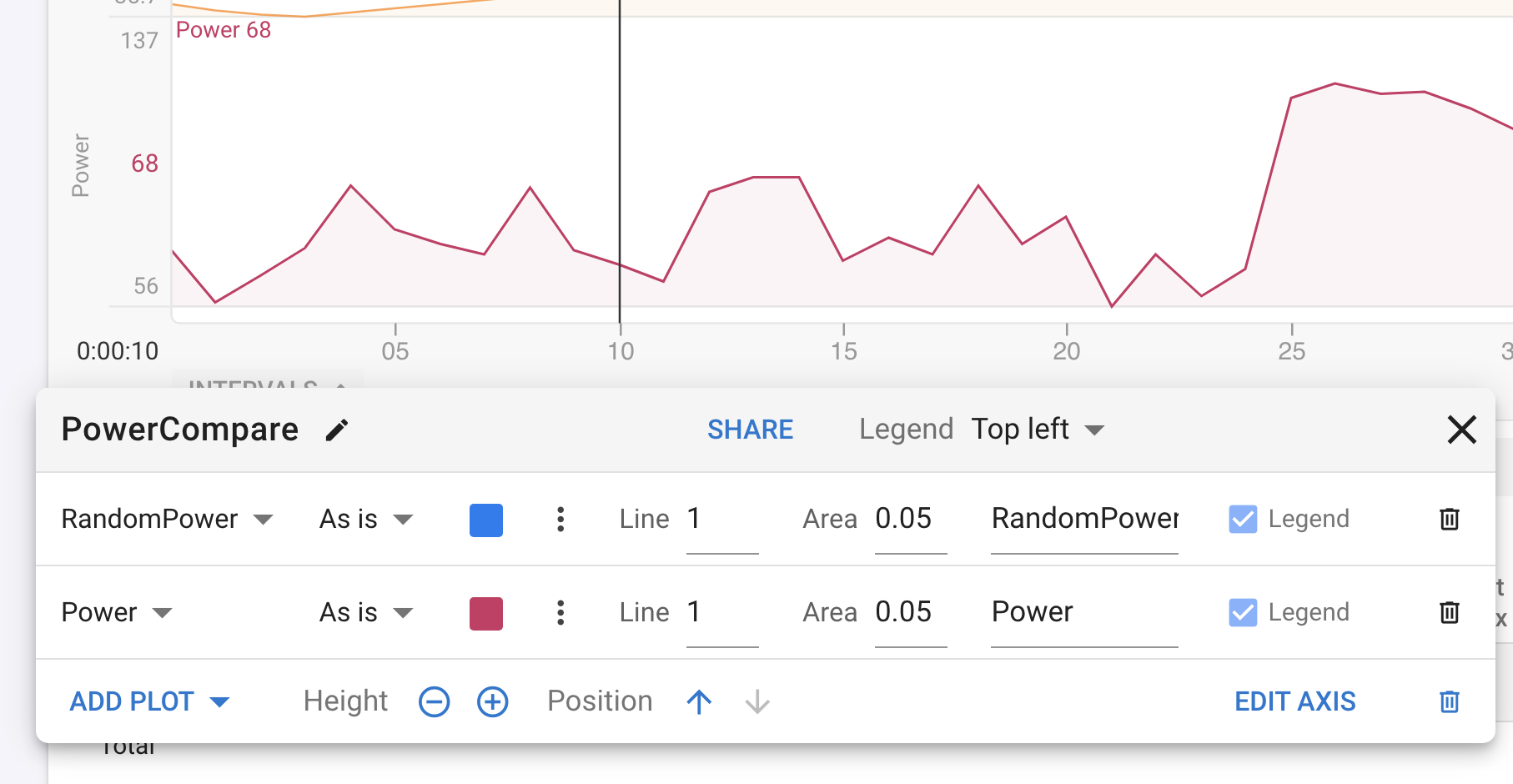
Hi all i always wanted to see a graph that compares power with hr with a little bit of extra smoothening and I think i finally found a neat way. Basically just add a custom chart in your activity page as follows.
The idea is to overlap the “60 second average power / HR” on top of another line showing the “workout average power / HR”. You need to remove all the auto detected intervals so that the whole workout appears as 1 interval and that way you can identify by how much your HrPw is degrading throughout the workout. Hope someone finds this helpful.
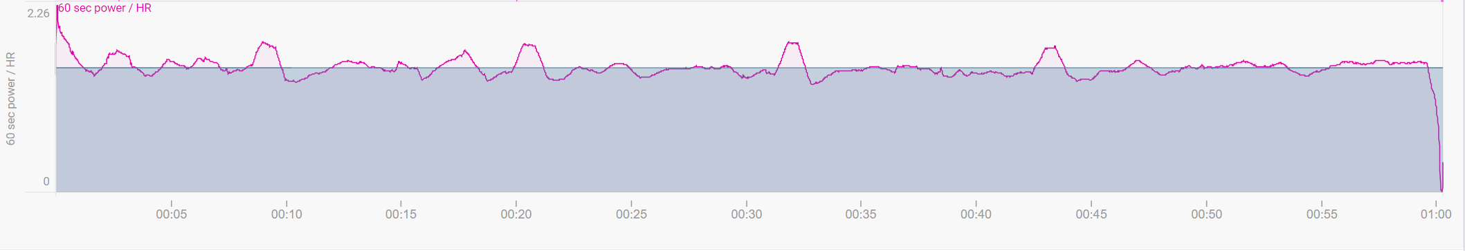
yep that’s it, you could make 1 interval covering 00:15 to 01:15 to get a more meaningful baseline average. then you should see your final block fall below the average line as your ratio degrades
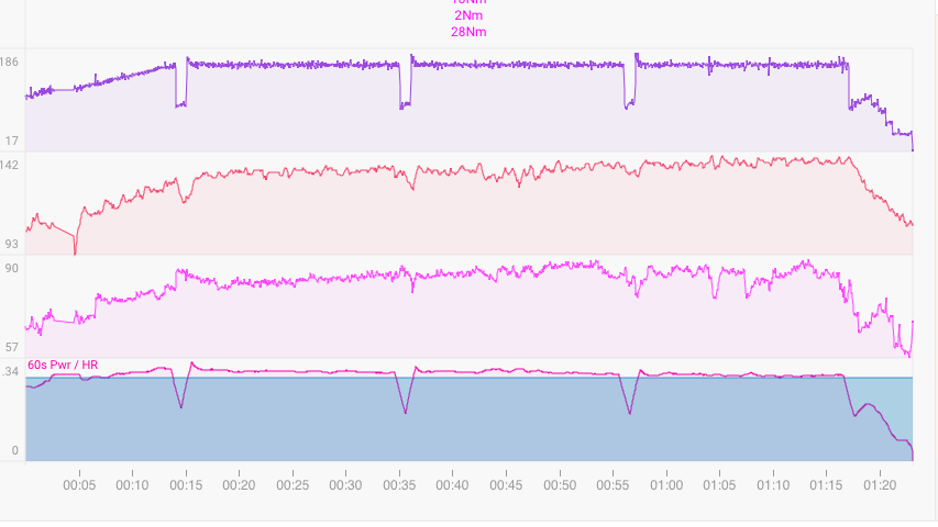
I did an Ironman a few weeks ago and had the feeling I should have pushed a bit more on the bike segment since I was able to execute the run with only a less that 2% decay between the first and the second half Marathon, even with some less that ideal pacing.
This chart is indeed showing that I was able to complete the 180k without any major drifting along the regular intervals and maybe I should have been a little more aggressive power wise allowing for some very moderate HR increase.
I had the auto-lap set for each 10km which kind of makes sense since the course is very variable alternating long ascents, technical descents, sharp climbs, tail wind and head wind sections.
So this chart in my opinion indeed demonstrates that in a lap by lap view, my drifting was totally within acceptable boundaries (maybe too acceptable)!
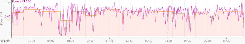
Thanks a lot for the suggestion. This chart is gold!
one click removal of all intervals not that i know of, and once intervals are removed you can re-auto detect by scrolling to the bottom Actions > Analyze
Thanks! I tried the color settings already but there isn’t a way to change the HR line, just the power line. I played around it some more and was able to get both lines bolded. I just added Power / HR as the second plot instead of the first one!
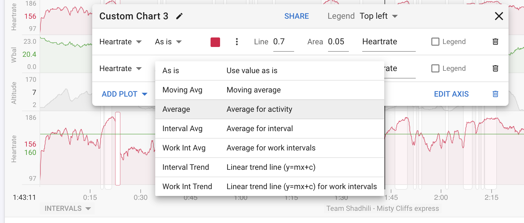
I added a new aggregate to make it easier to build these sort of charts. Choose “Average” to get the average value of the stream for the whole activity. You do not have to delete all the intervals anymore.