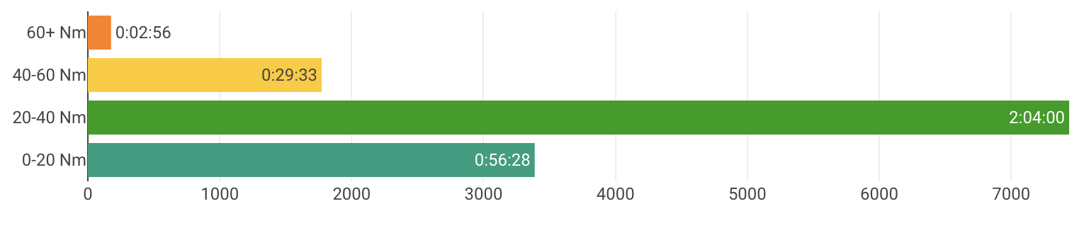
I added a “Time in torque zones” chart. You can search for that.
Here is the code. Anyone know how to get rid of the x axis or at least the tick labels?
{
  // max Nm for each zone
  let zones = [20, 40, 60, 999]
  let tiz = []
  for (let z of zones) tiz.push(0)
  let torque = icu.streams.torque
  let time = icu.streams.time
  for (let i = 0; i < torque.length; i++) {
    let secs = i > 0 ? time[i] - time[i - 1] : 1
    if (secs >= 30) continue
    let nm = torque[i]
    if (nm <= 0) continue
    for (let j = 0; j < zones.length; j++) {
      if (nm <= zones[j]) {
        tiz[j] += secs
        break
      }
    }
  }

  let y = []
  y.push("0-" + zones[0] + " Nm")
  for (let i = 1; i < zones.length - 1; i++) y.push(zones[i -1 ] + "-" + zones[i] + " Nm")
  y.push(zones[zones.length - 2] + "+ Nm")

  const ZoneColours = ["#009e80", "#009e00", "#ffcb0e", "#ff7f0e", "#dd0447", "#6633cc", "#504861" ]

  function formatTime(secs) {
    let s = secs % 60
    let m = Math.floor(secs / 60)
    let h = Math.floor(m / 60)
    m %= 60
    return h + ":" + (m < 10 ? "0" : "") + m + ":" + (s < 10 ? "0" : "") + s
  }

  let data = [{
    type: 'bar',
    x: tiz,
    y: y,
    text: tiz.map(formatTime),
    textposition: 'auto',
    hoverinfo: 'none',
    marker:{
      color: ZoneColours
    },
    orientation: 'h'
  }]

  let layout = {
    title: {
      text: "Time in torque zones",
      font: { color: 'black', size: 20 }
    }
  }

  chart = { data, layout }
}