Power diagram line colors

I would like to have the option to adjust the lines in the power graph. Now it is all same width and only difference is color. (who are quite similar) Especially on smaller screen it is very hard to see what line is what.
It would be superb if one could adjust the line width and format such as dots, lines etc, to make it more clear for ppl with tired eyes :slight_smile:

You may not be able to alter the “built in chart” but you can most certainly create your own.

Here you can see how I overlaid the 2 Power Meter Data (one from Developer Fields and the other the native Power Field)

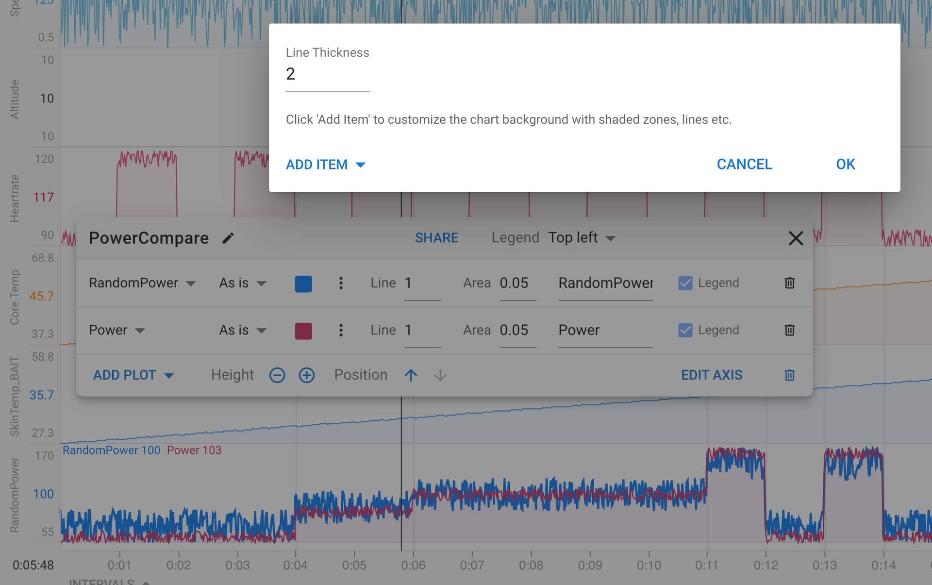
Press the 3 vertical dots beside the color and you get this option for line thickness

1 Like