@david can u add a timeline chart with colored pace zones in the activities as well?
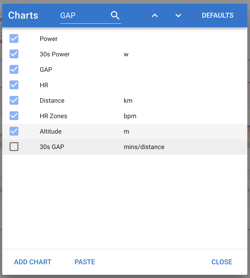
I have added a 30s GAP chart. This is like the 30s power chart. It shows a 30s centred moving average of gradient adjusted pace on a log scale. The slowest pace shown is 1.15 times the average GAP for the activity.

Hopefully this works for runners. I tried without the averaging and the pace data is too noisy to see anything. Also tried without the log scale and then you just get a green/blue cake with tiny bits of icing here and there.
2 Likes
Thx David. Like everytime the best support