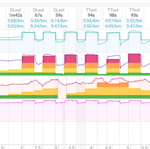
Is there a way to show the planned training in a diagram like in SPALT (shown in the 1st line)?
I want to use an overlay to compare the planned workout to the actual workout shown in the screenshot. In addition, an option to automatically set the intervals according to the scheduled ones would be very nice.
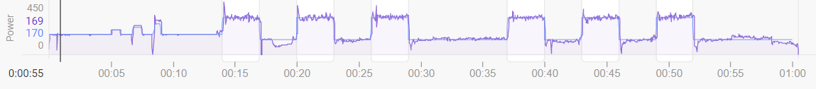
Like this?
Blue line is the planned workout, purple is the actual.
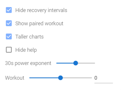
to get it synced according to the planned workout, there is an option (in Options), to move the interval to the left/right, depending on when the workout started. Drag the Workout slider left or right. The 0 value is seconds, if you know it can move by 5 seconds, or 30 seconds.
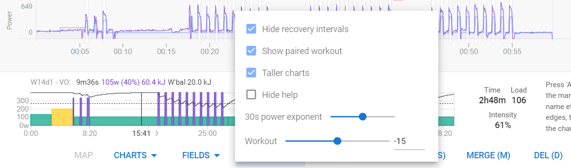
Here’s a workout where the slider is moved -15 seconds to bring the actual inline with the planned workout.
I only have the planned workout in the SPALT chart but I want it in a custom one like the 2nd row. There I created a diagram with the intervals and the associated tempo zones (colored). Now I would like to have the line for the planned pace in there. since there seems to be this information, my question is how do I get it in there. Maybe it is a problem about pace. Your example shows power
Yeah, I don’t run as much as I did prior to the pandemic starting. Let me see if I can use my data from 2018/19 to see if I can replicate what you’re looking.
Might only get to it on the weekend though.
1 Like