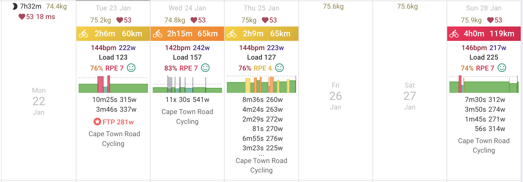
The first version of this is live now. It uses the interval data to generate a skyline plot:
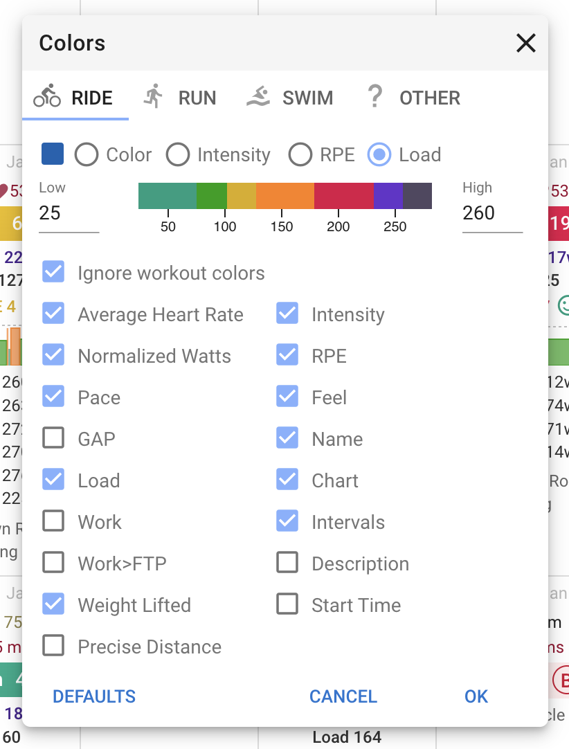
You can turn it on/off per sport (“Chart” checkbox) by doing Options → Colors on the calendar page:
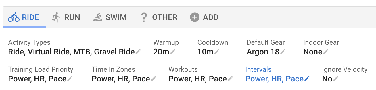
The “Intervals” setting for the sport determines what is used for the intensity and zone:
I will do an announcement and generate these charts for existing activities once the initial bugs have been sorted out. To get these for old activities you need to re-analyze them.