I tried to add colours to DFA/alpha plots, as you probably know, it works so that there is a threshold at 0.75, and another one at 0.5. I would like to have the same colours as in the garmin data field widget for the watch. But I cannot get the zones working:
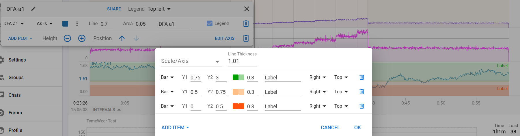
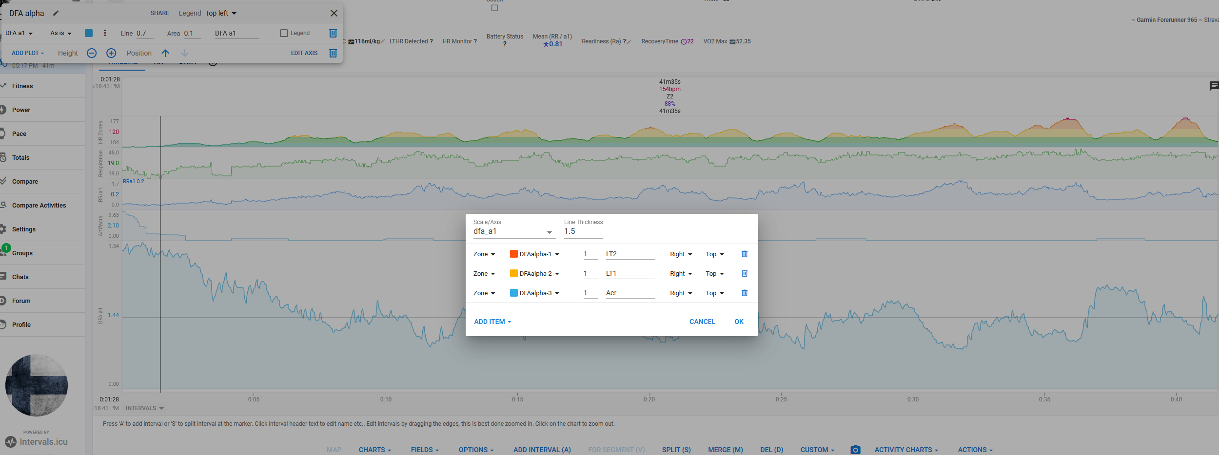
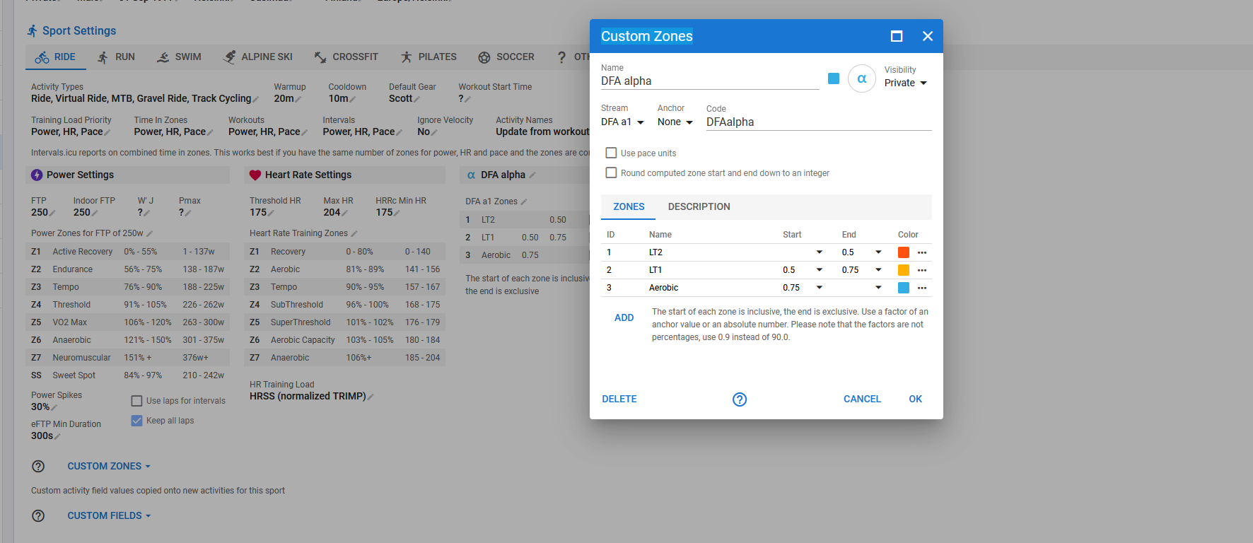
If you select to add zones, the plot will use the zones from the metric defined on the scale. But there are no zones by default for dfa-a1. You either make zones for the metric or you use Bars and colour code them as you want.
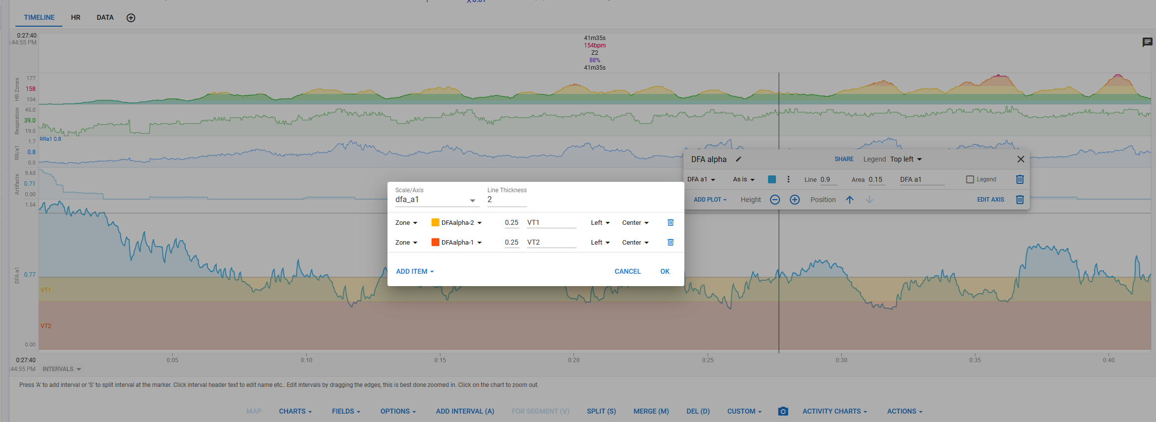
I think I got it working the way it’s intended now. Only thing is that the VT1 and VT2 zones are rendered as bands over the whole activity, instead of being present only on those parts where the alpha is actually below those thresholds, but I think this may be hard to do otherwise, since the DFA a metric is kind of reversed as opposed to the other metrics.