I was thinkin the same thing.
Yes, any update on this?
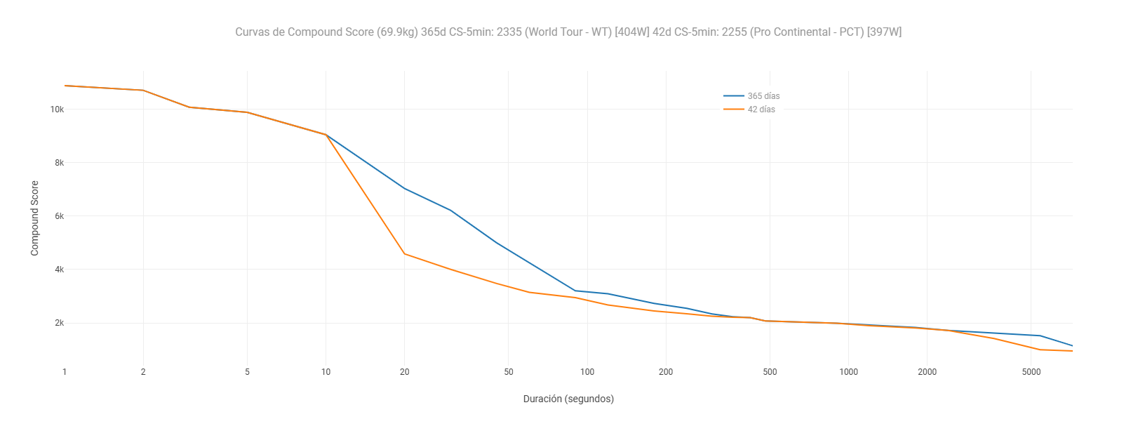
I have created this chart that evaluates the athlete, it is the compound score curve. The problem is that I currently have it in the activity, as it still cannot be programmed at the athlete level.
1 Like
I think they meant the comparison to other riders.
1 Like
How and where did you create the curves, including intervals?
I’d like to add that, but I have no idea how you did it. ![]()
I actually just created exactly the same plot, but wanted to have it on the athlete level (like power curve for e.g. last 42 days and all time). As I wasn’t able to program that, I stumbled upon this thread on the forum, and your post from one year ago. I now understand this unfortunately isn’t possible at this time, or did you find a solution in the meantime?
Is this question still relevant (one year later)?
Anyways, for users having the same question now or in the future: I went to an Activity, and then to the Power tab. I then added a new Activity chart and named it Compound Power Score. I used the following Plotly script:
{
let pc = icu.powerCurve
let secs = pc.secs
let watts = pc.watts
let wkg = pc.watts_per_kg
let x =
let y =
for (let i = 0; i < secs.length; i++) {
let d = secs[i]
// Only include durations up to 3600s (1 hour) for a clean curve
if (d > 3600) break
let w = watts[i]
let wk = wkg[i]
if (!w || !wk || w <= 0 || wk <= 0) continue
x.push(d)
y.push(Math.round(w * wk))
}
let data = [{
x: x,
y: y,
type: ‘scatter’,
mode: ‘lines’,
name: ‘Compound Score’,
line: { color: ‘#e67e22’, width: 2 }
}]
let layout = {
title: { text: ‘Compound Power Score (W²/kg)’ },
xaxis: {
title: { text: ‘Duration’ },
type: ‘log’,
tickvals: [5, 10, 30, 60, 300, 600, 1800, 3600],
ticktext: [‘5s’, ‘10s’, ‘30s’, ‘1m’, ‘5m’, ‘10m’, ‘30m’, ‘60m’]
},
yaxis: {
title: { text: ‘Compound Score (W²/kg)’ }
},
margin: { l: 50, r: 20, t: 40, b: 50 }
}
chart = { data, layout }
}
Hope this works for you. Cheers, Raimond
2 Likes